플렉스 박스 항목 배치
1. justify-content 속성 : 주축 기준의 배치 방법 지정하기
justify-content : flex-start | flex-end | center | space-between | space-around
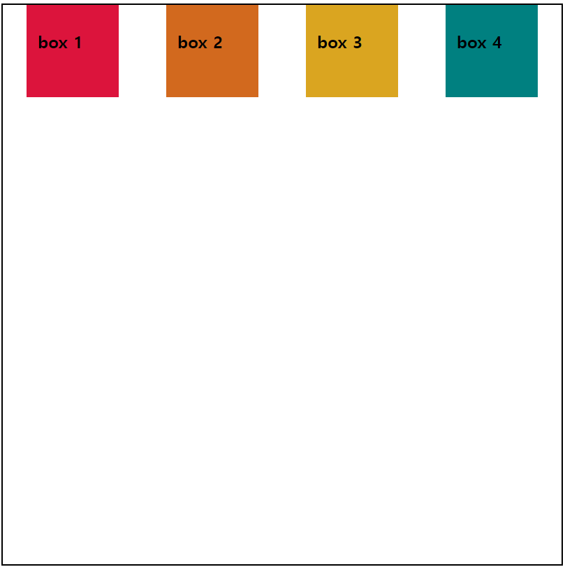
1️⃣ flex-start : 주축의 시작점을 기준으로 배치한다.
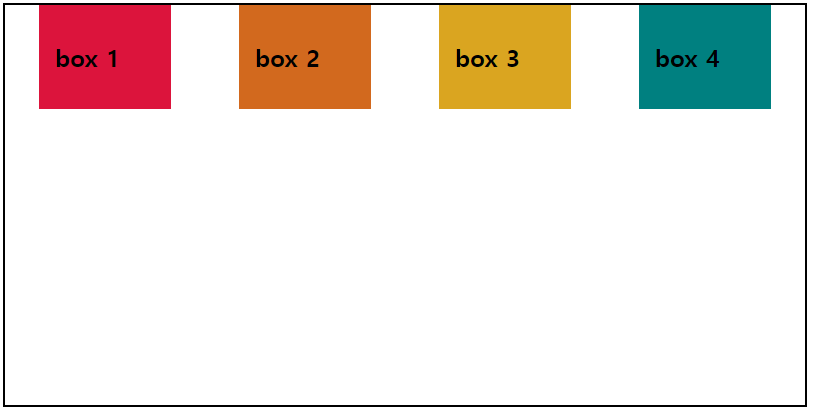
2️⃣ flex-end : 주축의 끝점을 기준으로 배치한다.
3️⃣ center : 주축의 중앙을 기준으로 배치한다.
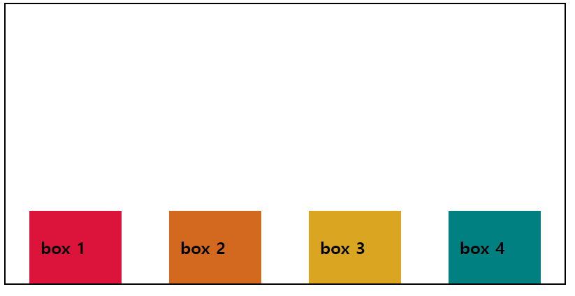
4️⃣ space-between : 첫 번째 플렉스 항목과 마지막 플렉스 항목은 시작점과 끝점에 배치한 후
중앙 항목들은 같은 간격으로 배치한다.
5️⃣ space-around : 모든 플렉스 항목들을 같은 간격으로 배치한다.
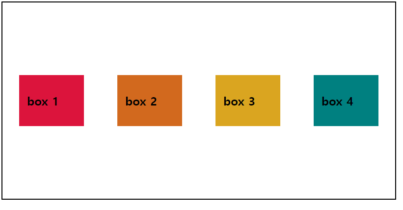
1️⃣ flex-start
    <style>
        .flex-container {
            display: flex;
            border: 2px solid black;
            width: 800px;
            height: 800px;
            flex-wrap: wrap;
            justify-content: flex-start;
        }
        .flex-container > div {
            width: 100px;
            height: 100px;
            padding: 1em;
        }
        .box1 {
            background-color: crimson;
        }
        .box2 {
            background-color: chocolate;
        }
        .box3 {
            background-color: goldenrod;
        }
        .box4 {
            background-color: teal;
        }

    </style>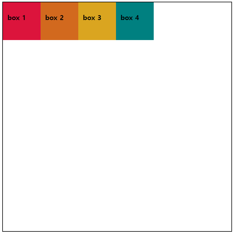
주축을 가로로 지정되어 있기 때문에 플렉스 항목이 시작점인 왼쪽부터 배치되었다.
2️⃣ flex-end
        .flex-container {
            display: flex;
            border: 2px solid black;
            width: 800px;
            height: 800px;
            flex-wrap: wrap;
            justify-content: flex-end;
        }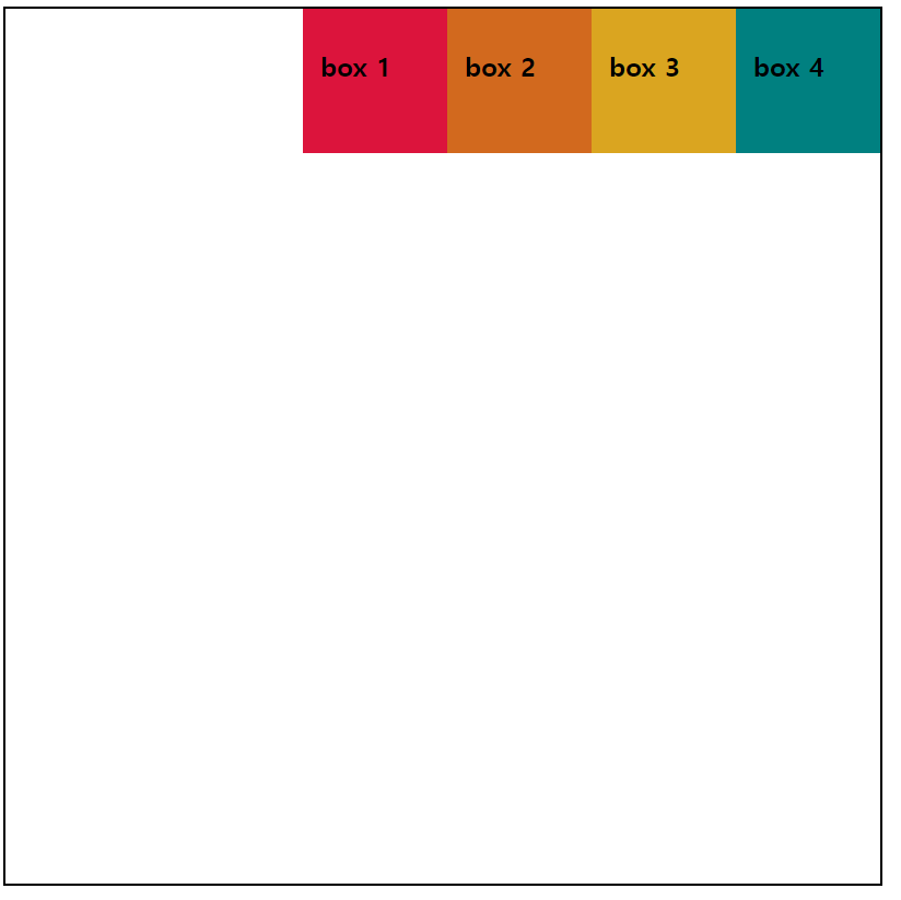
주축이 가로이고 플렉스 항목의 순서는 바뀌지 않았지만 전체적인 배치가 오른쪽 정렬처럼 적용되었다.
3️⃣ center
        .flex-container {
            display: flex;
            border: 2px solid black;
            width: 800px;
            height: 800px;
            flex-wrap: wrap;
            justify-content: center;
        }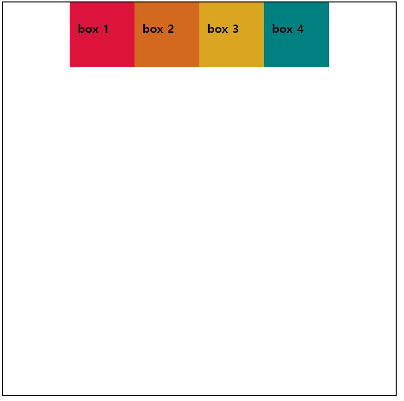
주축에 따른 항목 정렬 순서는 그대로이고, 전체적인 배치만 중앙 정렬로 적용되었다.
4️⃣ space-between
        .flex-container {
            display: flex;
            border: 2px solid black;
            width: 800px;
            height: 800px;
            flex-wrap: wrap;
            justify-content: space-between;
        }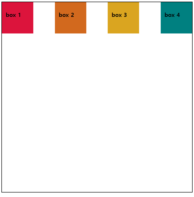
첫 번째 플렉스 항목은 주축의 시작점에, 마지막 플렉스 항목은 주축의 끝점에 배치되었고
나머지 플렉스 항목은 그 중앙에 같은 간격으로 배치되었다.
5️⃣ space-around
        .flex-container {
            display: flex;
            border: 2px solid black;
            width: 800px;
            height: 800px;
            flex-wrap: wrap;
            justify-content: space-around;
        }
모든 플렉스 항목이 같은 간격만큼 배치되어 있다.
2. align-items, align-self 속성 : 교차축 기준의 배치 방법 지정하기
align-items : stretch | flex-start | flex-end | center | baseline
align-self : stretch | flex-start | flex-end | center | baseline
1️⃣ stretch : 플렉스 항목을 확장해 교차축을 가득 채운다.
2️⃣ flex-start : 교차축의 시작점을 기준으로 배치한다.
3️⃣ flex-end : 교차축의 끝점을 기준으로 배치한다.
4️⃣ center : 교차축의 중앙을 기준으로 배치한다.
5️⃣ baseline : 시작점과 글자 기준선이 가장 먼 플렉스 항목을 시작점에 배치한다.
그리고 그 글자 기준선과 다른 항목의 기준선을 맞춰 배치한다.
1️⃣ stretch
    <style>
        .flex-container {
            border: 2px solid black;
            width: 800px;
            height: 400px;
            display: flex;
            justify-content: space-around;
            align-items: stretch;
        }
        .flex-container div {
            width: 100px;
            padding: 1em;
        }
        .box1 {
            background-color: crimson;
        }
        .box2 {
            background-color: chocolate;
        }
        .box3 {
            background-color: goldenrod;
        }
        .box4 {
            background-color: teal;
        }

    </style>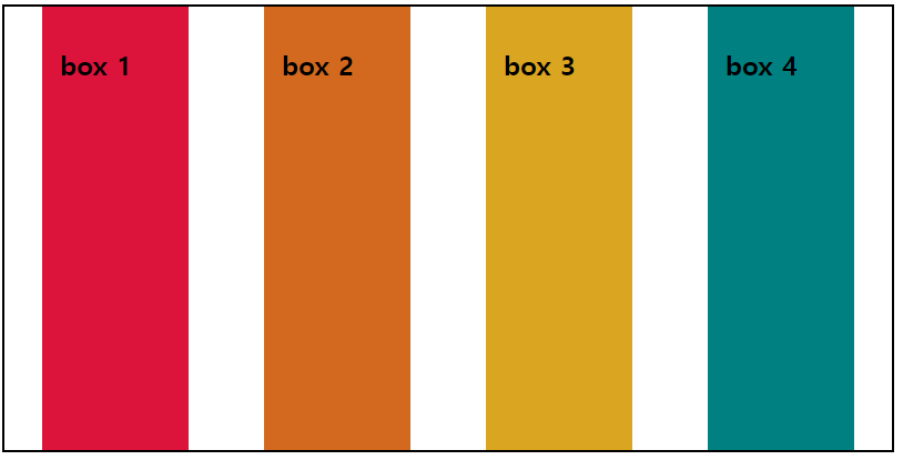
현재 교차축은 세로 방향으로 플렉스 컨테이너의 높이 크기만큼 플렉스 항목이 확장되었다.
2️⃣ flex-start
        .flex-container {
            border: 2px solid black;
            width: 800px;
            height: 400px;
            display: flex;
            justify-content: space-around;
            align-items: flex-start;
        }
교차축의 시작점이 현재 위쪽이기 때문에 위쪽을 기준하여 배치되었다.
3️⃣ flex-end
        .flex-container {
            border: 2px solid black;
            width: 800px;
            height: 400px;
            display: flex;
            justify-content: space-around;
            align-items: flex-end;
        }
교차점의 현재 끝점인 아래쪽에 맞춰 배치되었다.
4️⃣ center
        .flex-container {
            border: 2px solid black;
            width: 800px;
            height: 400px;
            display: flex;
            justify-content: space-around;
            align-items: center;
        }
교차축의 중앙을 기준하여 플렉스 항목이 배치되었다.
5️⃣ baseline
    <style>
        .flex-container {
            border: 2px solid black;
            width: 800px;
            height: 400px;
            display: flex;
            justify-content: space-around;
            align-items: baseline;
        }
        .flex-container div {
            width: 100px;
            padding: 1em;
        }
        .box1 {
            background-color: crimson;
        }
        .box2 {
            background-color: chocolate;
        }
        .box3 {
            background-color: goldenrod;
        }
        .box4 {
            background-color: teal;
        }

    </style>
</head>
<body>
    <div class="flex-container">
        <div class="box1"><h6>box 1</h6></div>
        <div class="box2"><h1>box 2</h1></div>
        <div class="box3"><h2>box 3</h2></div>
        <div class="box4"><h4>box 4</h4></div>
    </div>
</body>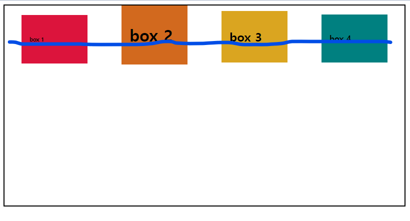
예시 코드에서 현재 시작점과 글자 기준선이 가장 먼 플렉스 항목은 박스 2번이다.
때문에 박스 2번의 기준선에 맞춰 다른 박스들이 정렬 배치된 것이다.
📌 교차축 배치 개별 적용하기
align-self 속성을 사용하면 플렉스 항목 개별적으로 배치 방법을 달리할 수 있다.
개별적으로 적용하기 때문에 해당 플렉스 항목에 속성을 명시해야 한다.
    <style>
        .flex-container {
            border: 2px solid black;
            width: 800px;
            height: 400px;
            display: flex;
            justify-content: space-around;
            align-items: center;
        }
        .flex-container div {
            width: 100px;
            padding: 1em;
        }
        .box1 {
            background-color: crimson;
        }
        .box2 {
            background-color: chocolate;
            align-self: stretch;
        }
        .box3 {
            background-color: goldenrod;
        }
        .box4 {
            background-color: teal;
        }

    </style>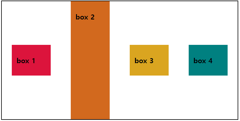
3. align-content 속성 : 여러 줄일 때의 배치 방법 지정하기
align-content : flex-start | flex-end | center | space-between | space-around
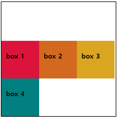
1️⃣ flex-start
    <style>
        .flex-container {
            border: 2px solid black;
            width: 400px;
            height: 400px;
            display: flex;
            flex-wrap: wrap;
            align-content: flex-start;
        }
        .flex-container div {
            width: 100px;
            height: 100px;
            padding: 1em;
        }
        .box1 {
            background-color: crimson;
        }
        .box2 {
            background-color: chocolate;
        }
        .box3 {
            background-color: goldenrod;
        }
        .box4 {
            background-color: teal;
        }

    </style>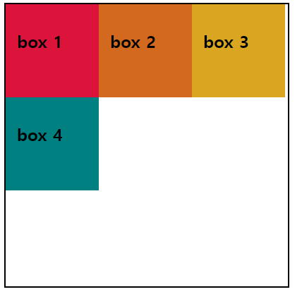
기본 값으로 시작점을 기준으로 배치된다.
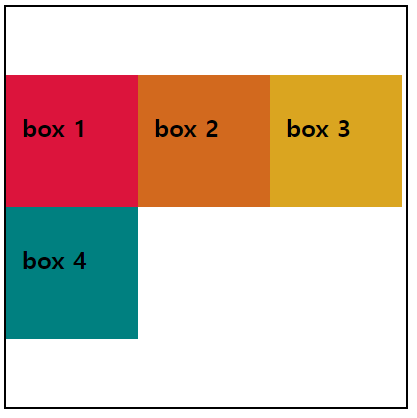
2️⃣ flex-end
        .flex-container {
            border: 2px solid black;
            width: 400px;
            height: 400px;
            display: flex;
            flex-wrap: wrap;
            align-content: flex-end;
        }
배치 순서는 그대로이고 위치만 교차축 끝점으로 적용되었다.
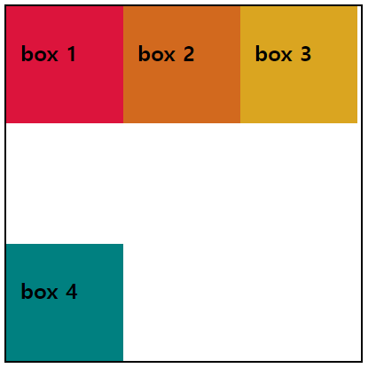
3️⃣ center
        .flex-container {
            border: 2px solid black;
            width: 400px;
            height: 400px;
            display: flex;
            flex-wrap: wrap;
            align-content: center;
        }
교차축을 기준으로 중앙에 위치한다.
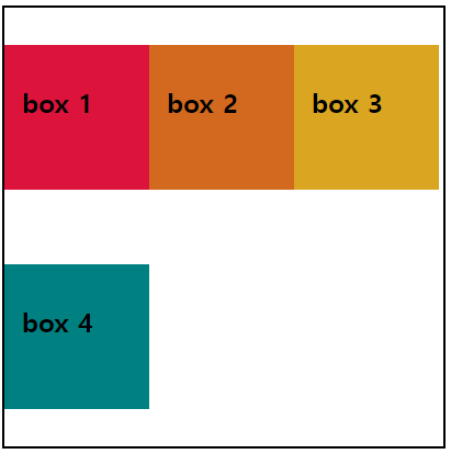
4️⃣ space-between
        .flex-container {
            border: 2px solid black;
            width: 400px;
            height: 400px;
            display: flex;
            flex-wrap: wrap;
            align-content: space-between;
        }
교착점의 시작점과 끝점으로 양쪽 정렬이 된다.
5️⃣ space-around
        .flex-container {
            border: 2px solid black;
            width: 400px;
            height: 400px;
            display: flex;
            flex-wrap: wrap;
            align-content: space-around;
        }
플렉스 항목이 간격을 두고 떨어져서 배치되었다.